Appointment Booking App
Since three months ago, we are in global health emergency because of COVID-19, and several measures must be taken to avoid overcrowding.
Many customer service businesses will have to work through appointments to comply with social distance.
Buky is a mobile app that is aimed at businesses that need to provide a service through appointments, either to improve their usual flow or because of the current need to avoid overcrowding.
Visual Design
Interaction Design
Prototyping
Figma
The current booking process
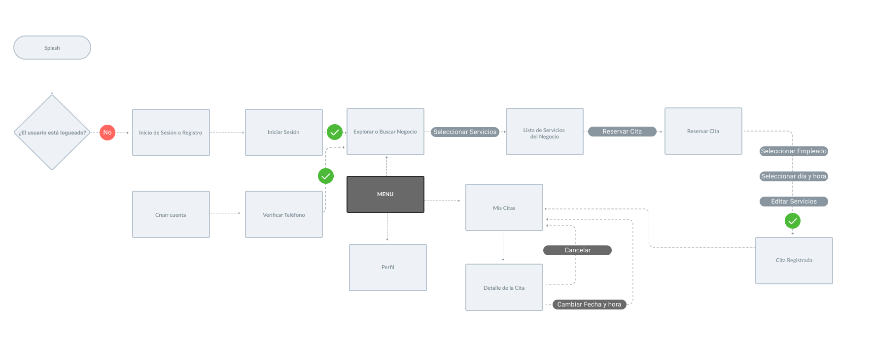
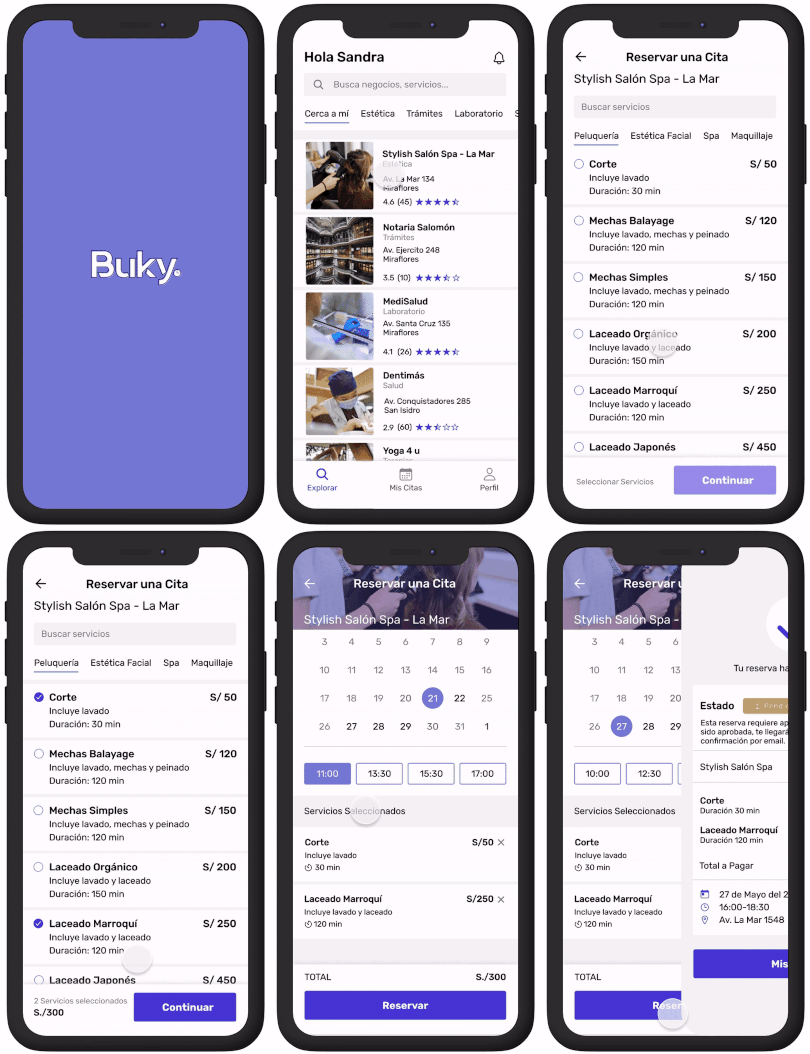
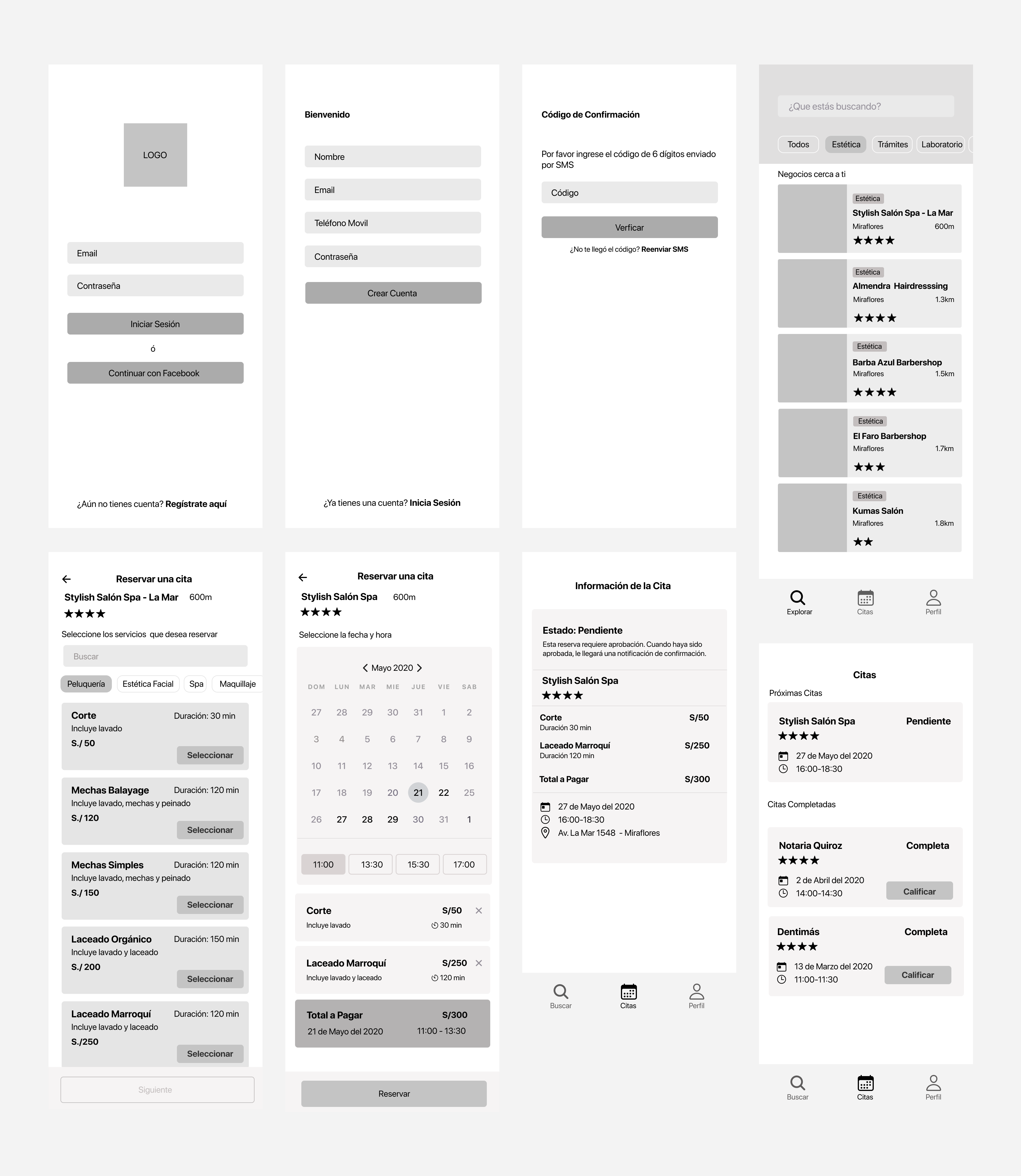
Based on the structure of the user flow, I designed the first version of the wireframes.
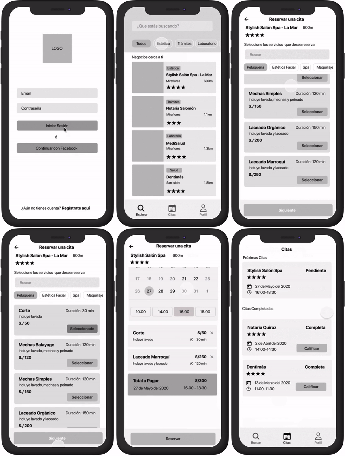
I built a prototype of the booking flow and tested it with three users.
Observations:
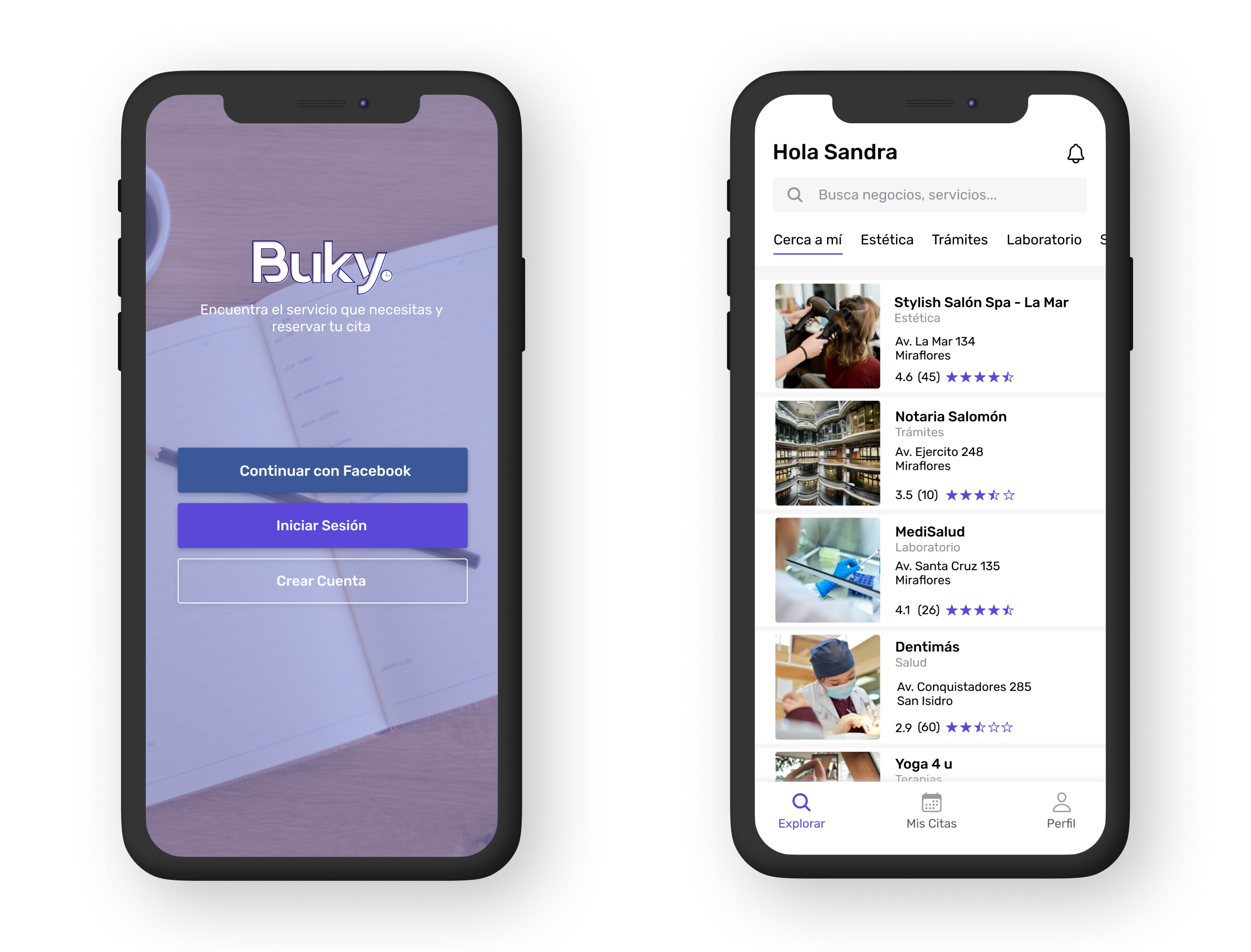
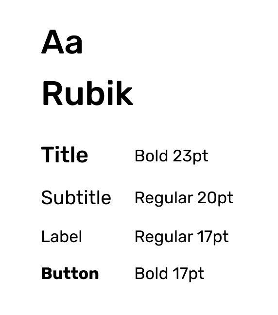
I decided to use a cool color with a clean and simple UI. I chose a strong purple as a primary color, mixed with a gray scale for balance and bring security and confidence to the user.
Taking into account the observations made by the users in the tests, I made improvements to the booking flow and applied it to high fidelity wireframes
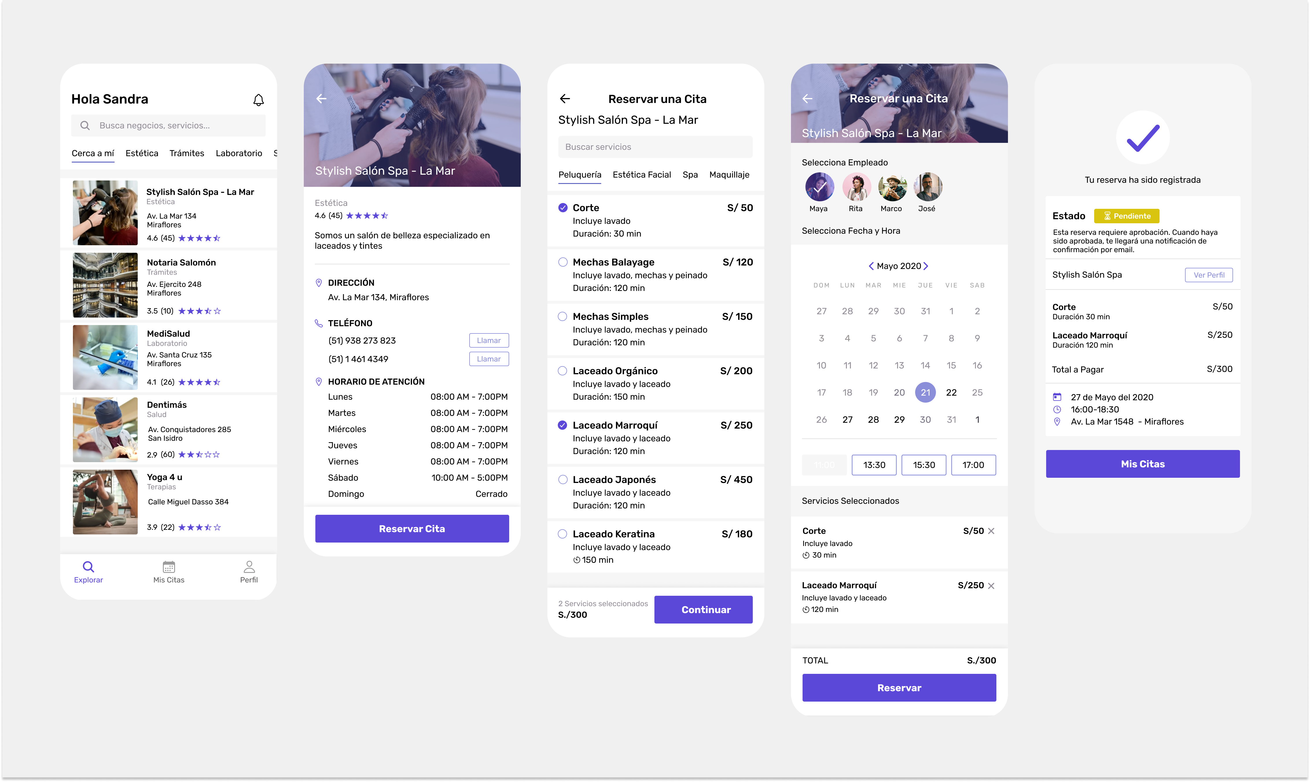
My original idea was to create a simple flow, with fewer options to select, but, in the tests, I realized that some users prefers more options and more information to trust in the application. If they are not able to select, for example, its favorite hair stylist, a dentist or an instructor, they will opt for call or use the WhatsApp for the booking instead
As a result, I am satisfied with the visual design, it could bring the confidence and reliability that an application like this needs.
